Area Charts
An area chart is used to visually represent quantity over a period of time. The quantity is laid out on the vertical axis, and the horizontal axis shows the time period being charted. What distinguishes an area chart from a line chart is the use of shaded regions below the line which better indicates the increase or decrease of volume.
The number of data points on a dashboard panel is limited to 1,000, and therefore only 1,000 data points are shown on a chart panel in dashboards.
To create an area chart, you must use a query that provides more than one data point in the Aggregates tab. Then the line is drawn between the data points to show the change.
For example, you could use the following query to create an area chart:
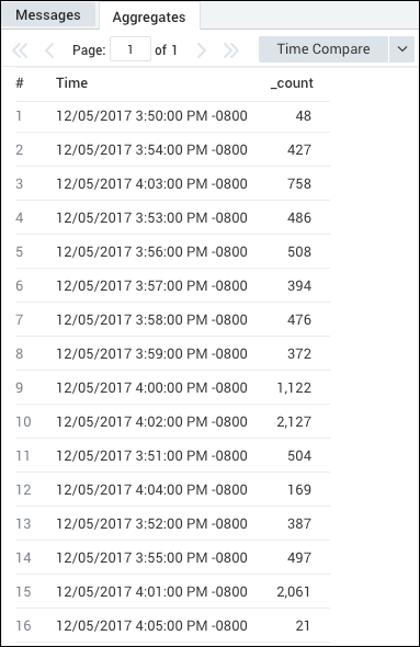
error | timeslice 1m | count by _timeslice
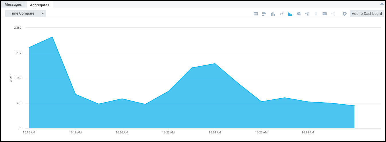
which would produce results such as:
To create an Area Chart:
Run a query.
In the Aggregates tab, choose the Area Chart icon to display the search results.

The data in the Aggregates tab is represented as an area chart.
For details on customizing the way your chart is displayed, see Edit Dashboards and Panels.