Boolean Single Value Charts
A Boolean Single Value chart displays a value as true or false, such as when a system is up or down.
To create a Boolean Single Value chart, use a query such as:
* | count as MyCount | if (MyCoun\>100,true,false) as MyCount
which would produce results like:

Create a Boolean Single Value chart
Run a Boolean query.
In the Aggregate tab, choose the Single Value icon.

This displays the result graphically.

(Optional) Click Add to Dashboard if you'd like to save the chart as a Panel.
Modify a Boolean Single Value chart
Change Properties
On the Search page, on the Aggregates tab, select the Settings icon.
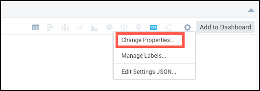
Select Change Properties.
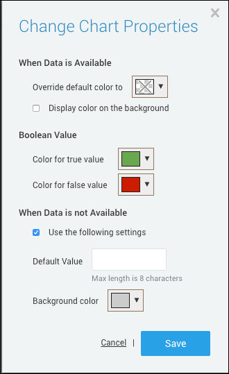
When Data is Available. When data is available for this query, the chart will use these properties:
- Color. Override the default color of text to a new color.
- Display color on the background. Activate this check box to use the selected color as a background. The text will be black or white depending on the color value.
Boolean Value. Select colors for the true and false values. Defaults are green for true and red for false.
When Data is not Available. When no data is available for this query, all When Data is Available options are ignored. But if the settings below are not configured, the chart will display no information
- Use the following settings. Activate this check box to display customized values for when no data is available.
- Default Value. Enter the message you would like to display when no data is available. The maximum length is 8 characters.
- Background color. Select a default background color to display when no data is available. The default is gray.
Click Save to save changes.
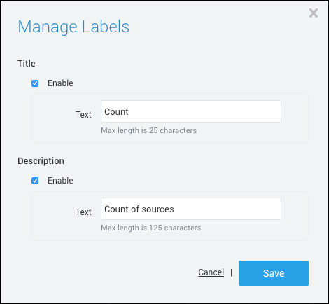
Manage Labels
In the Aggregates tab, select the Settings icon. Choose Manage Labels. This option allows you to enable a Title and a Description, including the text displayed and the color of the text. Click Save to save changes.
Edit Settings JSON. Allows you to directly edit the JSON code to change the appearance of the Single Value chart. Click Save to save changes.