Combo Charts
Combo charts allow you to create bar or column charts with a secondary vertical axis so you can add a separate line as a comparison.
The number of data points on a dashboard panel are limited to 1,000, and therefore only 1,000 data points are shown on a chart panel in dashboards.
For example, say we're running a query like:
_sourceCategory=*apache*
| parse "HTTP/1.1\" * * * " as status_code, size, referrer
| timeslice 5m
| avg(size), count by _timeslice
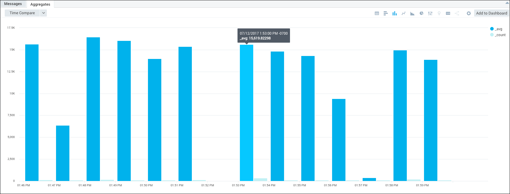
Generally, this query would produce a bar or column chart that looks a bit like this:
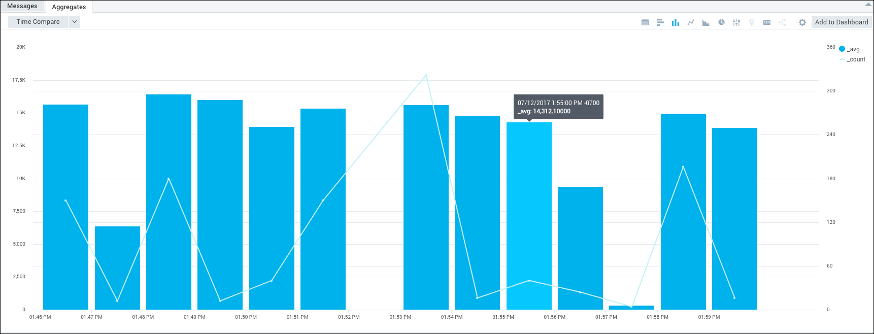
But with a combo chart, you can set the _count to display as a line chart on a second axis, so the count value is represented by a line instead of a bar. You will be able to see the number of requests over time (_count), against the average number of bytes per request (_avg=avg(size)).
Then you can add combo chart panels to a dashboard or view them in the Aggregates pane.
To create a combo chart:
Run a query.
In the Aggregates tab, choose the Column Chart icon to display the search results.

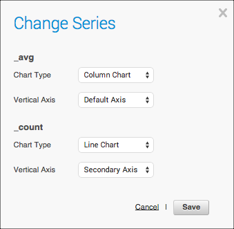
To add a second axis, click the Settings icon in the Aggregates pane, then choose Change Series.
In the Change Series dialog box, choose the value you'd like to add as a secondary axis and chart type. In our example, for the
_countvalue, we set:- For Chart Type, select Line Chart.
- For Vertical Axis, select Secondary Axis.
Click Save.
The combo chart is built and displayed.