Donut or Pie Charts
Donut or pie charts are useful for visually comparing the percentage of events that have occurred, such as the type of error that occurs the most in your system. A donut or pie chart will compare different values for the same field, if you want to compare values for different fields consider using a histogram.
The number of data points on a dashboard panel are limited to 1,000, and therefore only 1,000 data points are shown on a chart panel in dashboards.
To create a donut or pie chart, use an aggregate query that provides at least a few results in the Aggregates tab.
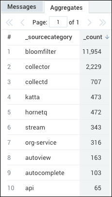
For example, you could use the following simple query to get results from your logs:
(error OR fail*) AND exception | count by _sourceCategory | sort by _count
which would produce results such as:
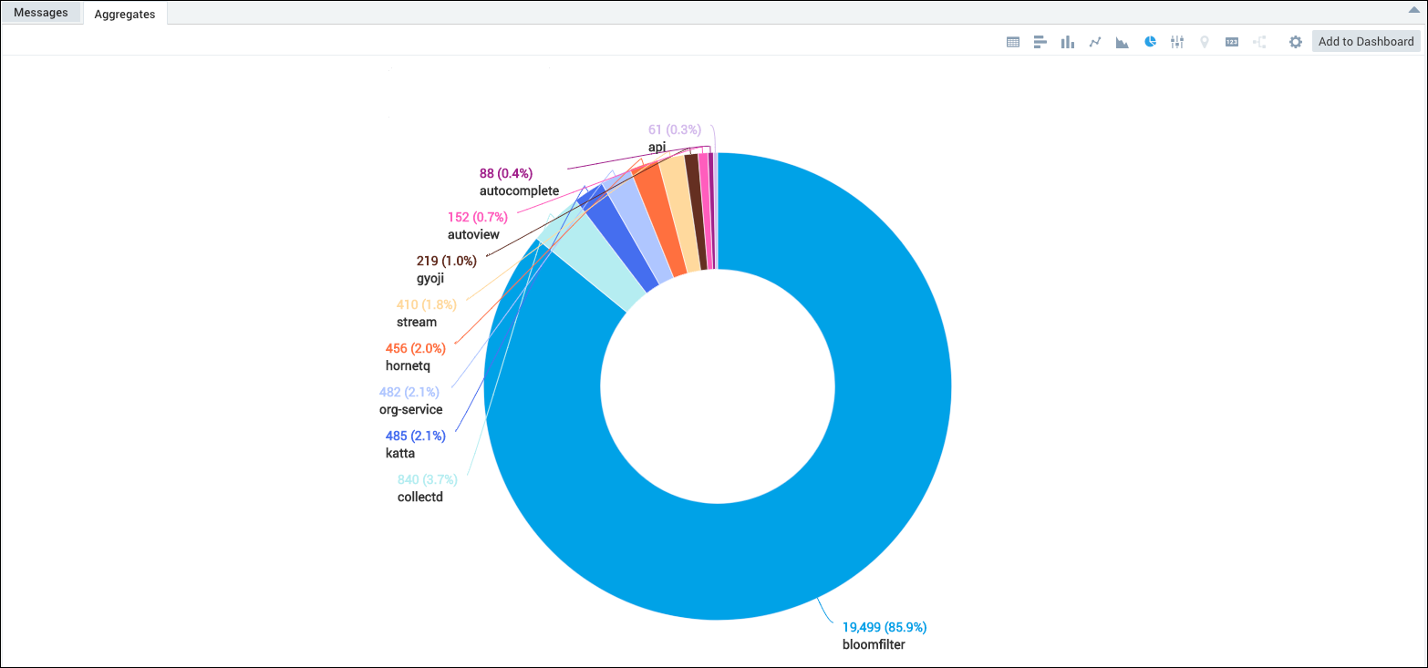
Pie Chart Labels
Pie chart labels on dashboard panels are intended to be a single line, due to the size of the display area. Pie chart labels are shown in multiple lines in the larger display area of a Search page. The comparison of single line and multi line Pie chart labels is illustrated in the following example.
Create a Donut or Pie Chart
Run a query. For example, we could use our previous sample query:
(error OR fail*) AND exception | count by _sourceCategory | sort by _countIn the Aggregates tab, choose the Pie Chart icon to display the search results.

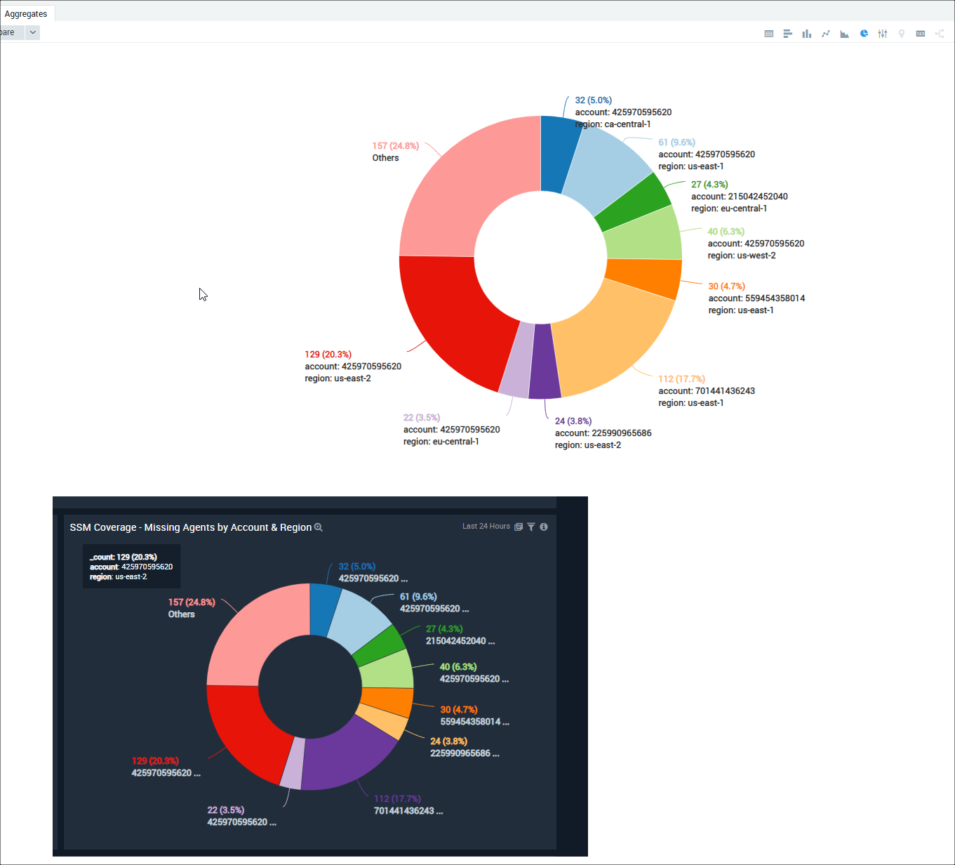
The data in the Aggregates tab is represented as a pie chart.
Modify a Donut or Pie Chart
By default, we provide donut charts and truncate field names at the end. If you want a pie chart or to change other display properties you can.
In the Search page, on the Aggregates tab, select the Settings icon.
Select Change Properties. Change any of the following:
Display. Default chart style is a donut. To change to a pie chart, deselect the check box.
Label Truncation. To change the way labels are truncated, choose either End or Middle. If you choose End label truncation, it means that a value, such as an IP address, could be shortened to 100.100..., so that the beginning of the value is retained. Choosing Middle means that an IP address could be shortened to 100...100, so that the beginning and the end of the value is retained.
Slice Borders. Show a border between each slice color. This border will match the color theme you have selected for your dashboard.
Maximum Number of Slices. Enter a maximum number of slices.
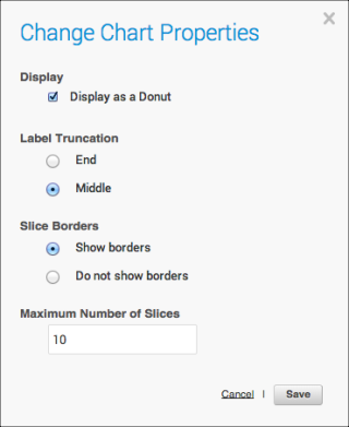
Click Save.