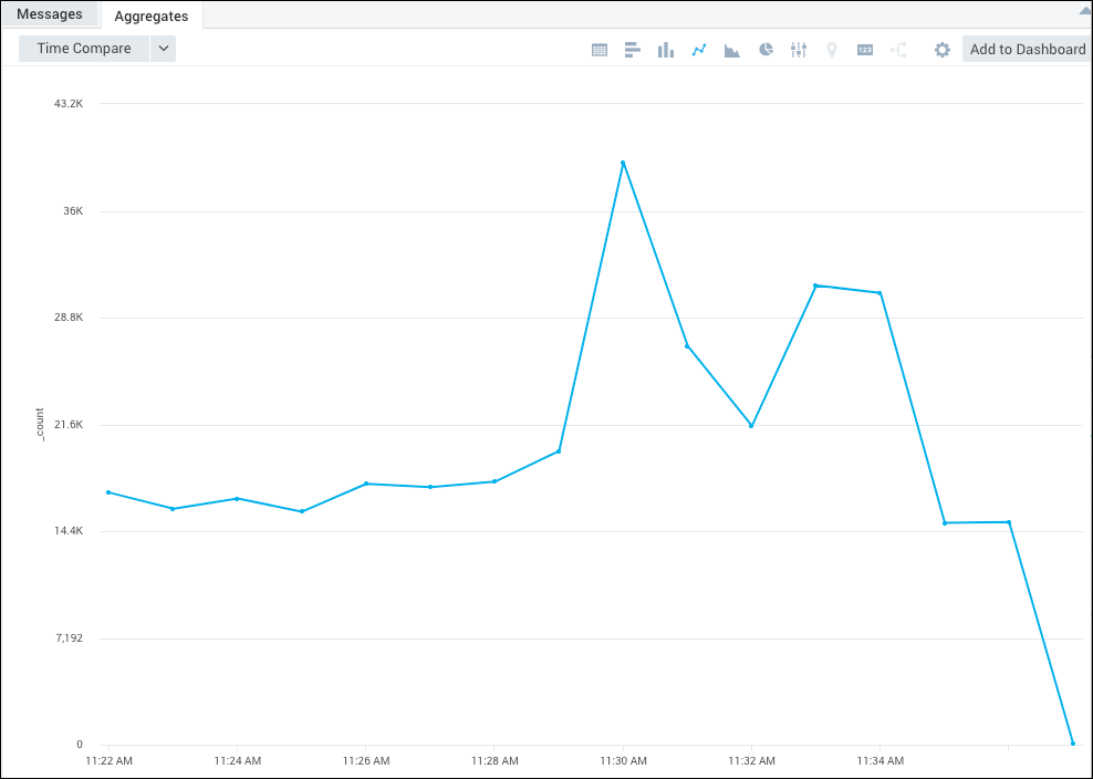
Line Charts
Line charts are useful for displaying how data changes over time, where the Y axis of a line chart displays the count of an item, and the X axis is a timeline. To create a line chart, you need to use a query that provides more than one data point in the Aggregates tab. Then the line is drawn between the data points to show the change.
All chart types in Sumo required data that has been aggregated. You cannot chart raw data.
The number of data points on a dashboard panel are limited to 1,000, and therefore only 1,000 data points are shown on a chart panel in dashboards.
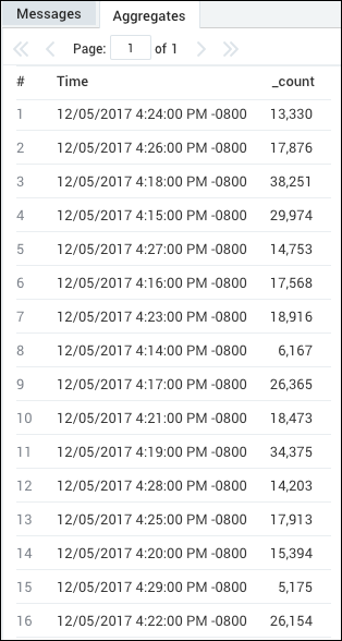
For example, you could use the following query to create a Line chart:
error | timeslice 1m | count by _timeslice
which would produce results such as:
To create a Line Chart:
Run a query.
In the Aggregates tab, choose the Line Chart icon to display the search results.

The data in the Aggregates tab is represented as a line chart.
For details on customizing the way your chart is displayed, see Edit Dashboards and Panels.