Map Charts
Map charts show the location and number of hits from data on a map.
The number of data points on a dashboard panel are limited to 1,000, and therefore only 1,000 data points are shown on a chart panel in dashboards.
To map your data you can:
- use the geoip or Geo Lookup operators to provide these values from extracted IPv4 and IPv6 addresses.
- manually provide valid aggregated latitude and longitude values. Ensure the field names are 'latitude' and 'longitude' so that map chart can recognize them. Format the values with positive or negative values based on being north/south or east/west, instead of using the terms N/S, E/W, such as,
30.42and-87.21.
Here's an example of the values you can parse out your log file using map:
* | "30.42" as latitude | "-87.21" as longitude | count by latitude, longitude
For example, you could use the geoip operator to create a map chart:
| parse "remote_ip=*]" as client_ip
| geoip client_ip
| count by latitude, longitude
| sort _count
Or, you could use the geo lookup operator to create a map chart:
_sourceCategory=Error
| parse regex "(?<client_ip>\d{1,3}\.\d{1,3}\.\d{1,3}\.\d{1,3})"
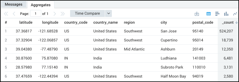
| lookup latitude, longitude, country_code, country_name, region, city, postal_code from geo://location on ip = client_ip
| count by latitude, longitude, country_code, country_name, region, city, postal_code
| sort _count
which would produce results such as:
Rules
- Latitude and longitude values need to be provided with the fields 'latitude' and 'longitude' respectively.
- Latitude and longitude values need to be positive or negative based on being north/south or east/west, instead of using the terms N/S, E/W.
- A
_countaggregator is required. - Other aggregators like
sumoravgdo not provide accurate results.
Limitations
- Map charts have a display limit of 10,000 results.
- Colors of map markers cannot be changed.
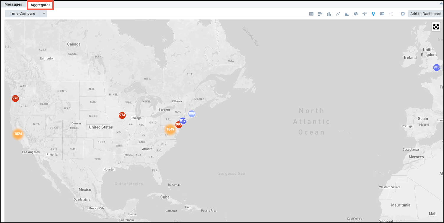
Create a Map Chart
Run a Geo Lookup query.
In the Aggregates tab, choose the Map Chart icon to display the search results.

The data in the Aggregates tab is represented as a map chart.
The number of data points on a dashboard panel are limited to 1,000. Therefore, only 1,000 data points are shown on the maps panel in dashboards.
For more information on geolocation operators, see the Geo Lookup operator.