Table Charts
Table charts are the default chart type in the Aggregates tab. They are useful for listing the type and number of events that have occurred, such as the type of error that occurs the most in your system. To create a table chart, use a search query that provides at least a few data points in the Aggregates tab.
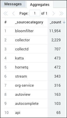
For example, you could use the following query to create a simple Table chart:
(error OR fail*) AND exception | count by _sourceCategory | sort by _count
which would produce results such as:
Create a table chart
Run a query.
In the Aggregates tab, click the table chart icon.

The data in the Aggregates tab is represented as a table chart.
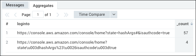
URL Links in table chart panels
If your query looks for URLs, when you create a table chart panel, the URLs displayed in the table will be displayed as working links.
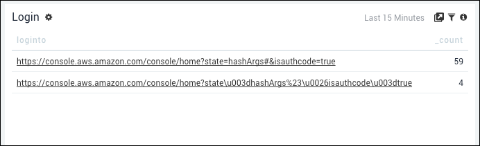
For example, if you used this query to search for hits to the Sumo Logic Help system:
_sourceCategory=aws/cloudtrail | keyvalue "LoginTo" | count loginto | sort - _count
You would see results such as the following in the Aggregates tab.
Then, use the following steps to create a table chart panel.
Create a table chart panel
- Click Add to Dashboard to create a table chart panel.
- When the table chart panel appears in your Dashboard, make sure the Edit toggle is off.
- The links become live. If you click a link, it will open the displayed URL in a new tab.