Manage Axis Settings
See the following sections to view, edit, and manage X- and Y-axis settings.
Change Gridlines on the Y Axis
When you create a Line Chart or an Area Chart you can add gridlines to the chart, and also customize how those gridlines are displayed.
To change gridlines on the Y axis:
On the Dashboards page, click the Edit button.
Click the Panel's Settings icon.
Click Y Axis.
Minor gridlines. Here you can select:
- Use default interval. Keeps the default gridlines.
- Enter an interval. Click here, and a suggested value is automatically entered. To change the gridline interval, enter a positive numeric value. Example: For the Y axis in the example above, the data ranges from 0 to 14.3k and shows default grid lines at 0, 4,750, 9,500, and 14.3k. So if you want to see 10 grid lines between 0 and 4,750, divide 4,750 by 10 (4750/10 = 475). For the Y axis Grid Line Interval enter 475, and you will see 10 grid lines between 0 and 4,750.
Minor gridline color. To modify the gridline color, select a color from the picker.
Click Save.
If the whole area is covered with color rather than grid lines of color, the interval is too low. Calculate a larger number based on the data ranges returned by your search query. Also, in the Chrome web browser, if the number of grid lines is too low, it could freeze the browser window or crash the Search page. If this occurs, you will see a warning message.
Change the Range of the Y Axis
Your can specify a Minimum Value and Maximum Value for the Y axis range.
To change the scale of the Y axis:
On the Dashboards page, click the Edit button.
Click the Panel's Settings icon. The Settings dialog appears with the Chart Type selected.
In the left menu bar, click Y Axis.
Under Range, enter a Minimum Value and Maximum Value in the respective fields.
Click Save.
Change the X Axis
When you create a Line Chart or an Area Chart you can add gridlines to the X axis of the chart, and customize how those gridlines are displayed once the Panel is added to a Dashboard.
To change Gridlines on the X Axis:
- On the Dashboards page, click the Edit toggle.
- Click the Panel's Settings icon.
- Click X Axis.
- Minor gridlines:
- Use default interval. Keeps the default gridlines.
- Enter an interval. Click here, and a suggested value is automatically entered. To change the gridline interval, enter a positive numeric value for the frequency that you want to see the gridlines in relation to the query and the data it has returned. (For the timeslice X axis, the unit is seconds. For example, if you enter interval of 60, gridlines will appear every 60 seconds.)
- Minor gridlines color. To modify the gridline color, select a color from the picker.
- Click Save.
If the whole area is covered with color rather than grid lines of color, your interval is too low. Calculate a larger number based on the data ranges returned by your search query. Also, in the Chrome web browser, if the number of grid lines is too low, it could freeze the browser window or crash the Search page. If this occurs, you will see a warning message.
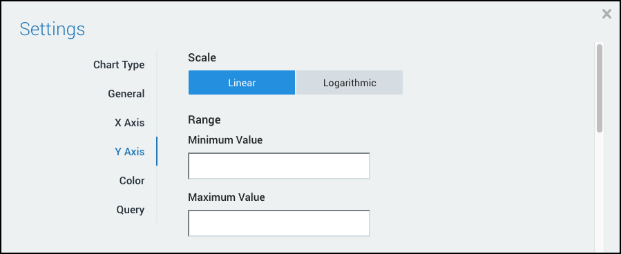
Change the Scale and Range of the Y Axis
This page demonstrates how to change the scale and range of the Y axis for a panel from the Settings dialog.
- You can modify a chart's Y axis to use either a linear or logarithmic scale.
- You can modify the range (default values) for the Y axis, by specifying a Minimum Value and Maximum Value.
This procedure applies to Column, Line, and Area chart types.
To change the scale and range of the Y axis, do the following:
On the Dashboards page, click the Edit button.
Click the Panel's Settings icon. The Settings dialog appears with the Chart Type selected.
In the left menu bar, click Y Axis.
Under Scale, select one of the following options:
- Linear. (Default) A linear scale on the Y axis represents equal distance and change on a chart. So for example, if grid lines are enabled, a change of three spaces on a line graph may represent an increase of 3MB of data.
- Logarithmic. A logarithmic scale uses an equal distance and percentage change. When graphing values that display over a wide range, change the scale to logarithmic to make the smaller values easier to perceive.
Under Range, enter a specific Minimum Value and Maximum Value.
Click Save.
Change the Axis of a Panel on the Search Page
You can change the minimum and maximum values of a Panel to influence the results displayed. You can also set the Panel to use Log Scale.
To change the axis of a Panel:
On the Search page, in the Aggregation tab, click the Settings icon and select Change Axis.
Do any of the following:
- To edit the default (automatic) values used for a Panel's axis, type specific values for Minimum Value and Maximum Value.
- To change to either Linear Scale (default) or Log Scale, choose that option.
Click Save.
Add a Secondary Y Axis
You can add a secondary Y-axis to a bar or column chart to create a combo chart. For details of query requirements, see Combo Charts.
To add a secondary Y-axis:
On the Dashboards page, click the Edit button for the panel chart.
Click the Panel's Axes icon
 .
.For Right Y-Axis, select show axis. You can also modify both Y-axes, including the following:
- Scale. Select a scale for the axis:
- Linear. (Default) A linear scale on the Y-axis represents equal distance and change on a chart. So for example, if grid lines are enabled, a change of three spaces on a line graph may represent an increase of 3MB of data.
- Logarithmic. A logarithmic scale uses an equal distance and percentage change. When graphing values that display over a wide range, change the scale to logarithmic to make the smaller values easier to perceive.
- Range. Enter specific values for Minimum Value and Maximum Value.
- Scale. Select a scale for the axis:

Click the Panel's Display Overrides icon
 .
.Configure two overrides:
- For first Y-axis: Set the Query or series name to the first query. For Style, select AxisYType to Left Y-Axis. This set the primary Y-axis.
- For second Y-axis: Set the Query or series name to the second query. For Style, select AxisYType to Right Y-Axis. This set the secondary Y-axis.
A second Y-axis is displayed in the preview.
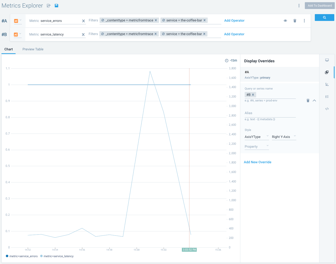
Click Save. If this is a new panel, click Add to Dashboard.