Manage Charts
See the following sections to view, edit, and manage charts on dashboards.
Change the Chart Type
On the Dashboards page, you can change a chart's type, depending on the result of your query. If the query you have used doesn’t support a certain chart type, an error message is displayed.
- On the Dashboards page, click the Edit button.
- Click the Panel's Settings icon.
- The Chart Type dialog is displayed.
- Select a chart type of your choice from the listed options.
- The query is displayed as the new chart type in the preview below. (If the query you’ve used doesn’t support a certain chart type, an error message is displayed.)
- Click Save.
You can try the different Chart Types available to visualize your data.
Change the Color of a Chart
The colors used in a chart are assigned randomly. You can change the color at any time by editing the Panel settings.
To change the color of a chart, do the following:
- On the Dashboards page, click the Edit button.
- Click the panel Settings icon.
- In the Settings dialog, click Color.
- Select a color.
- Click Save.
Search Page Edits
Change the Color of a Chart by Value Range on the Search Page
When viewing search results displayed as a bar chart or column chart in panels or in the Aggregates tab, you can choose to change the color of a bar or column depending on the value range of the search output. This setting doesn't affect the query; it's only applied to query results.
At a glance, you'll be better able to see if a value is out of an acceptable range, or is under an important threshold. For example, say we've created a dashboard panel that displays results for user log ins over 24 hours. We'd like to see right away any user that has logged in more than 30 times in the past day. We can have a column that shows 30 or more log ins display as bright red, which is easily distinguishable from our other columns.
To change the color of a column by value range:
On the Search page, in the Aggregates tab, click the Settings icon and select Change Properties.
In the Color section:
- Type a number in the From Value text box.
- You can leave the To Value text box empty if you don't want to set an explicit value; otherwise type a number in the box.
- For Color, choose a pre-set option, or choose a custom color.
Click Add if you would like to set another value range. For example, you can create "stop light" values of green, yellow, and red ranges indicating low, medium, and high threshold warnings.
Click Save.
Change Chart Properties on the Search Page
Though colors used in a chart are assigned randomly, you can change the color at any time by editing the Chart Properties. You'll also find the option to change the way labels are truncated.
To change properties of a chart:
On the Search page, in the Aggregates tab, click the Settings icon and select Change Properties.
Do any of the following:
- Label Truncation. To change the way labels are truncated, choose either End or Middle.
- End label truncation means that a value, such as an IP address, could be shortened to 100.100...., so that the beginning of the value is retained.
- Middle means that an IP address could be shortened to 100...100, so that the beginning and the end of the value is retained.
- Stacking. For stacked charts, choose a stacking option; either None, Normal, or Percent. (This option won't change the appearance of any other type of chart.)
- Color. To change the color scheme used in the chart, select a color option.
Click Save.
Change the Label Size
You can change the font size of the title and labels for any chart with an X axis.
To change the size of a chart title and labels, do the following:
On the Dashboards page, select the Edit button.
Click the Panel's Settings icon. The Settings dialog appears.
In the left navigation menu, click Y Axis.
Under Font Size, specify a size for the chart Title and Label.
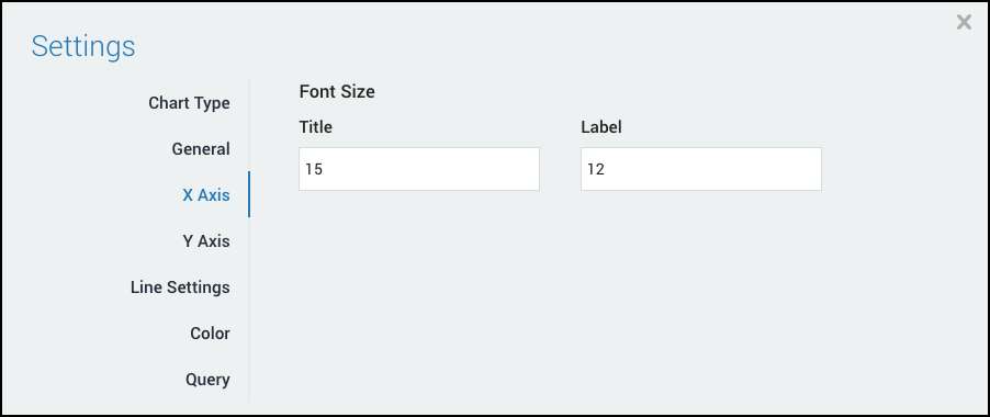
Click Save.
Change Table Chart Settings
For a table chart, you can change the way text is truncated, and the font size.
To change Table Chart settings:
On the Dashboards page, select the Edit button.
Click the Panel's Settings icon.
In the Settings dialog, click General.
Under Text Truncation, choose:
- None to display all log message text.
- Middle to shorten a log message, so that the beginning and the end of the message is retained.
- End to shorten a log message so that it ends with ..., so the beginning of the value is retained.
Under Font Size, select Small, Normal, or Large.
Click Save.
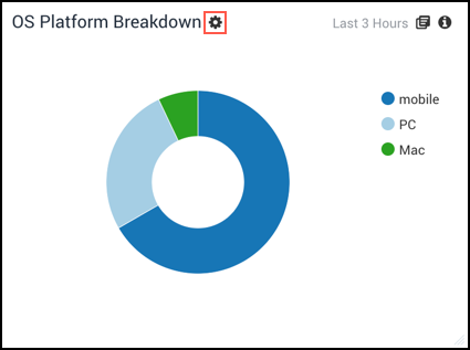
Change Donut or Pie Chart Settings
Within the dashboard, a panel can display a pie or a donut chart, and you can toggle between the two as you choose. Both types of charts can display multiple slices at once, and the number of slices being displayed can be changed.
To change a Donut or Pie chart:
On the Dashboards page, select the Edit button.

Click the Panel's Settings icon.
In the Settings dialog, click General.
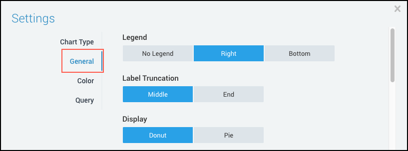
Under Display, select:
Donut. (Default) Displays a hole in the center.
Pie. Displays a complete circle.
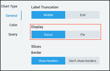
Under Slices, in Border select:
Show borders. (Default) These are the thin lines that separate the slices.
Don’t show borders. Removes the lines.
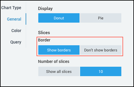
Under Number of Slices select:
Show all slices to display all data.
Or click the default number 10 to enter a new value.
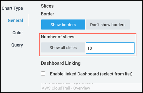
You can also change the position of the Legend, Label truncation, and Dashboard Linking in this page. See Manage Dashboard and Manage Panels.
Click Save.
Change Single Value Chart Settings
For Single Value charts, you can change the chart's numeric value, unit prefix, labels, and also settings for when data is not available.
To edit a Single Value chart:
On the Dashboards page, select the Edit button.
Click the Panel's Settings icon.
In the Settings dialog, click General.
For Numeric Value:
- Select Show number or Don’t show number. If you don’t show a number, the chart is displayed as a solid color.
- Unit. Define the unit to append to the value. Maximum length is 6 characters.
For Labels:
- Title. Enter an optional title for the chart. Maximum length is 25 characters.
- Description. Enter an optional description for the chart. Maximum length is 125 characters.
When Data is Not Available: When no data is available for this query, all previous options are ignored. But if the settings below are not configured, the chart will display no information.
- Use the following settings. Activate this check box to display customized values for when no data is available.
- Default Value. Enter the message you would like to display when no data is available. The maximum length is 8 characters.
- Background color. Select a default background color to display when no data is available. The default is gray.
Click Save.
Show Grid Lines
When you create a Line Chart or an Area Chart to be used in a Panel, you can add grid lines to the chart, and also customize how those grid lines are displayed.
To show grid lines:
On the Search page, in the Aggregation tab, click the Settings icon and select Grid Lines.
Select Enable grid lines. By default, the check boxes For X axis and For Y axis are selected, and automatic (default) grid lines are used in the chart. The default should satisfy most use cases, but you can customize how the grid lines are displayed.
X or Y Axis. You can select or deselect the check boxes For X axis and/or For Y axis.
Grid Line Interval. Enter a positive numeric value for the frequency that you want to see the grid lines in relation to the query and the data it has returned. (For a timeslice X axis, the unit is seconds. For example, if you enter X interval = 4, grid lines will appear every 4 seconds.)
noteIf the Y axis in your line chart is logarithmic, (under Change Axis, for Chart Scale, select Log Scale), the Grid Line Interval field will be grayed out, and the chart will use automatic (default) grid lines.
For the Y axis in the example below, the data ranges from 0 to 2,560 and shows default grid lines at 0, 640, 1,280, 1,920, and 2,560. So if you want to see 10 grid lines between 0 and 2,560, divide 2,560 by 10 (2560/10 = 256). For the Y axis Grid Line Interval enter 256, and you will see 10 grid lines between 0 and 2,560.
Grid Line Color. To modify the grid line color, you can use:
- A six digit hexadecimal code, for example, #00FF00.
- A simple string, such as red or blue.
- An RGB value, like rgb(0,255,0).
Click Save.
If the whole area is covered with color rather than grid lines of color, the Grid Line Interval is too low. Calculate a larger number based on the data ranges returned by your search query. Also, in the Chrome web browser, if the number of grid lines is too low, it could freeze the browser window or crash the Search tab. If this occurs, you will see a warning message.
Change the Line Properties of a Chart
You can modify the properties of chart lines in the following ways:
- Use smooth curved lines (splines)
- Add markers and specifying the marker type
- Specify line thickness
This procedure only applies to Line and Area charts.
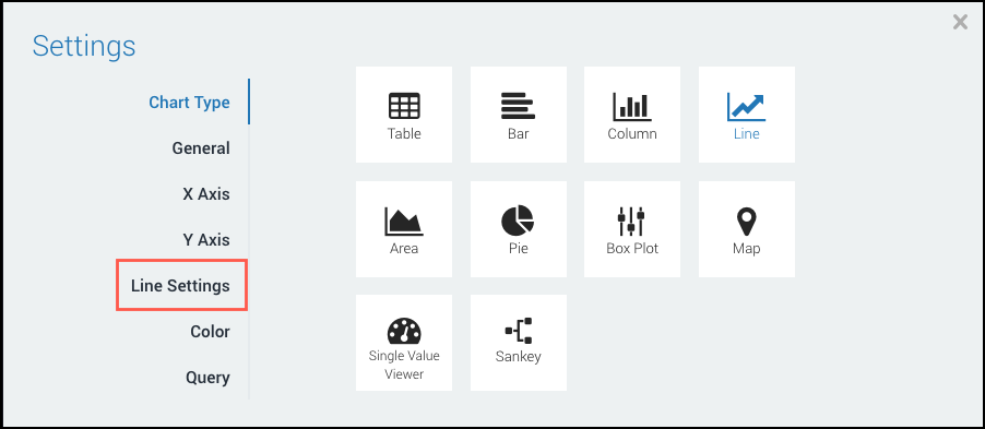
To change the line properties of a chart, do the following:
On the Dashboards page, click the Edit button.
Click the Panel's Settings icon. The Settings dialog appears with the Chart Type selected.
In the left menu bar, choose Line Settings.
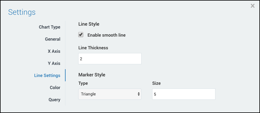
To use smooth lines in a chart, under Line Style select the Enable smooth line checkbox.
Specify a Line Thickness.
Under Marker Style, choose a Marker Type from the drop-down list and specify a Size.
Click Save.
Change the Stacking Option
For the Bar, Column, Line, or Area charts, you can choose a stacking option; either None, Normal, or Percent. This option won't change the appearance of any other type of chart.
To change the Stacking Option in your chart:
On the Dashboards page, select the Edit button.
Click the Panel's Settings icon.
In the Settings dialog, select General.
Under Stacking, select:
- None for no stacking.
- Normal for normal stacking.
- Percent uses the full height of the chart. Each graphed series is a percentage of the total.
Click Save.
For details on how to create a stacked column chart, see Column Charts.