Chart Search Results
In the Aggregates tab, in addition to the standard table view, you can view search results as a chart, such as a bar or column chart.
Only search results that have been aggregated using a group or aggregate operator can be charted. See Group or Aggregate Operators for a list.
When charting aggregate results from a query, the grouping function defines the plotted values on the one axis, and the grouping operator determines the values on the other axis. For example, group by _sourceHost produces a bar or point for each host. If you're using
multiple group-by functions, a separate bar or point represents each set of grouped results.
To chart aggregate results:
- From a search, run an aggregate query.
- From the Aggregates tab, click a graph button on the Aggregates tab.
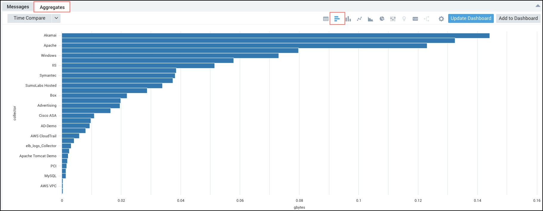
For this example, you can see a bar chart, but you can pick from any of the available charting options, see Chart Panel Types for details.
Why are the chart options not available?
Your data may be a string data type instead of a number. Most aggregate operators will cast your data to a number, operators like first and last don't. You can cast your data to a number if needed using the num operator.
Example:
_sourceCategory=concierge completed execution
| parse "Execution duration: * s" as duration
| timeslice 5m
| first(duration) as duration by _timeslice
| num(duration)
| sort by duration
For details on casting your data to a string or numeric data type see Casting Data to a Number or String for details.