Interacting with Metrics Charts
This topic pertains to our Classic Metrics UI (Legacy). For information about the Metrics Explorer UI, which replaces the Classic Metrics UI, see Metrics Explorer.
Learn how you can interact with metric charts and use the options on the Query and Legend tab of the metric query page.
Interacting with the chart area
The top half of a metric query tabs contains a visualization. This section describes the options and controls available in the chart area.
Zoom in on a time series chart
When you’re viewing a metric chart whose Panel Type is “time series”, you can zoom in for greater detail. Note that, if your time series query uses automatic quantization, when you zoom in, the chart presents results based on more granular data: the bucket size across which results are quantized is reduced.
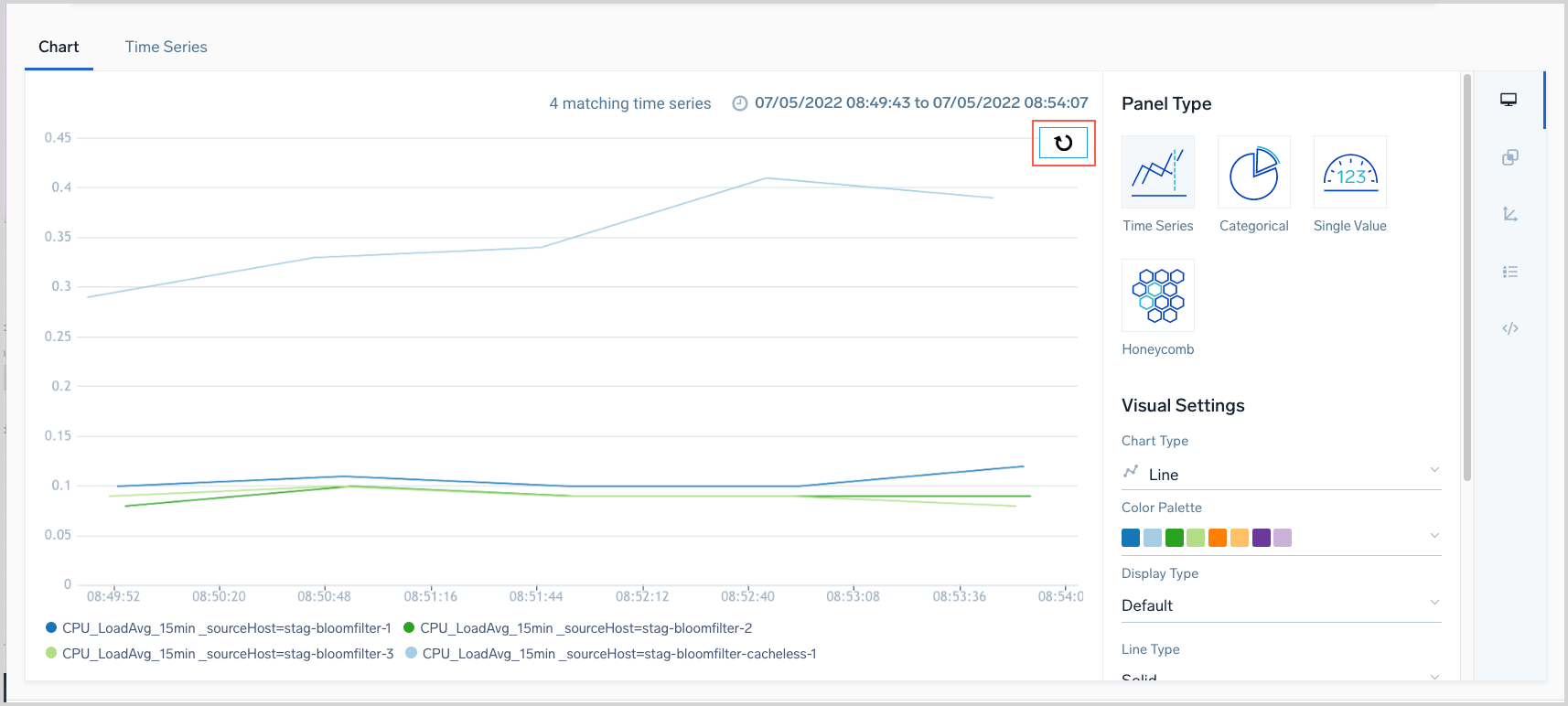
To zoom in on a chart, depress the left button on your mouse, keep the button pressed and move the mouse across the chart to the desired spot and release the button. As you select a chart area, it will be highlighted. When you release the button, the chart is zoomed, and an icon appears that you can use to reset the chart.
Change the time range
You can specify a time range for the query relative to the current time, or specify a custom time range. To set time ranges, click the time range currently shown near the top of the page, marked 2 in the screenshot above.
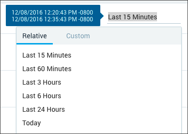
The current time range is displayed, along with the following options to set the time:
Relative. Select an interval relative to the current time. The display is updated as soon as you make a selection.
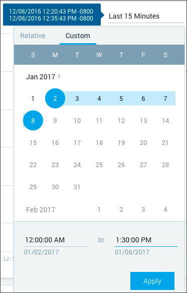
Custom. Click a date to select it as the start date, then move your cursor to the desired end date and click to select it. The date settings shown below the calendar are updated. You can scroll to navigate between months or click to go to a specific month. To specify the time, highlight the portion of the time value you want to change, and modify the entry.
Recent. If you have specified any relative or custom time ranges during your current login session, they are available for selection under Recent.
Focus on a time series in a line chart
You can focus on a particular time series in a visualization by clicking the line chart for the series. The focus changes to that time series, and the other time series in the visualization are hidden. If outlier bands are enabled, the band for that chart displays. Click the background or outlier band area to remove the focus and hide the band.
This capability is supported only for line charts.
Display details for individual values
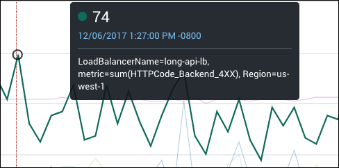
Hover over a location in the chart area to see the details for an individual reading. The following information is displayed:
- The number at the top of the details pop-up is the value on the chart.
- A date and timestamp are included.
- The tags that are included in the visualization are listed.
Adjust the quantization interval
In metric visualizations, rather than charting individual data points, Sumo presents the aggregated value of the data points received during an interval.
Quantization is the process by which Sumo aggregates metric data points for time series over an interval, for example, an hour or a minute, using a particular aggregation function: avg, min, max, sum, or count. You can use the quantize operator in a metric query to explicitly specify a quantization interval and aggregation function.
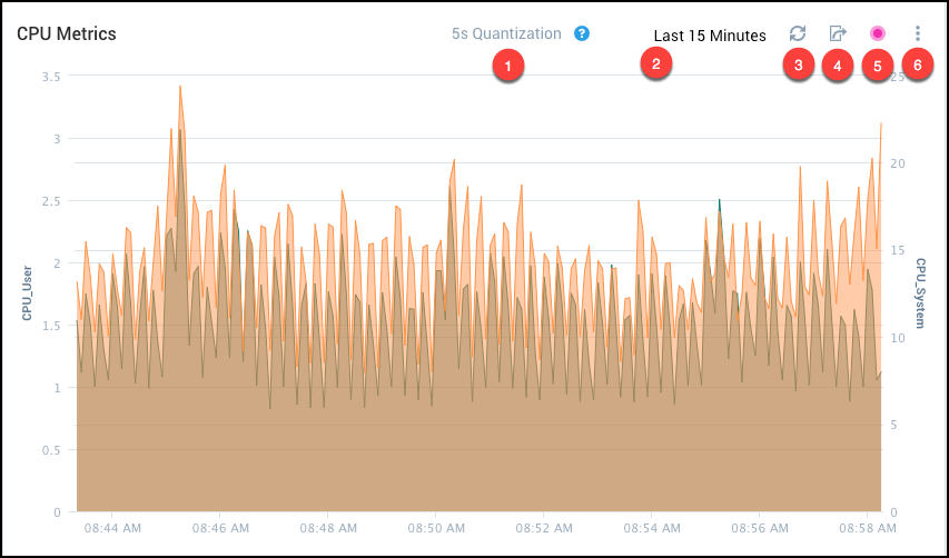
Otherwise, if you run a metric query without using the quantize operator, Sumo automatically determines an optimal quantization interval, based on the age of the data you are querying and the number of data points. The quantization interval is shown at the top of the metric query tab. (This area is labeled 1 in the screenshot in Interacting with the chart area above.) The quantization interval aligns your time series data to common intervals on the time axis (for example every one minute) to optimize the visualization and performance.
If you have a quantization interval that you prefer to use, you can select your own target interval. Click the current quantization interval at the top of the chart
When you select a target quantization, Sumo sets the actual quantization interval to be as close to the target as possible. If it is not possible to set the actual interval to the targeted interval (typically because too many data points would be produced to reasonably show on the chart), a message is displayed, letting you know that Sumo has set the interval to be as close as possible to your target.
Set outlier options
The metrics outlier feature allows you to identify metrics data points that are outside the range of expected values. You can use outliers to pinpoint unusual behavior in your metrics visualizations and track the behavior over time. You can use the outlier control (labeled 5 in the screenshot in Interacting with the chart area For instructions in setting outlier options, see Metrics Outliers.
Share a metric chart
After you run a metric query you can obtain a URL for the chart and send it to other users so that they can view the chart. The sharing control is labeled 4 in the screenshot in Interacting with the chart area above. For instructions on sharing a metric chart, see Share a Metric Chart.
Refresh the display
In most cases, the visualization updates automatically with new data and to reflect changes in settings. To refresh the display on demand, click the refresh icon in the upper right corner of the page, labeled 3 in the screenshot in [Interacting with the chart area](/1947/merge/docs/metrics/metric-charts/interacting-metric-charts above.
Use Legend tab options
The Legend tab on the metric query page lists detailed information for each time series displayed on the metric chart.
Display selected time series
By default, the chart area displays all of the individual time series that match your queries. Click the Legend tab in the lower area of the page to see a list of all the time series.
Each time series is presented in the chart with a separate color. The legend shows the line color and style for each time series and the tags that are included in the series.
Click the visibility icon for a row to show or hide an individual time series in the visualization.
Click the visibility icon in the header row to show or hide all of the time series in the visualization.

View Avg, Min, and Max for a time series
The Avg, Min, and Max values for a time series over the selected time range are displayed as columns in the Legend tab.

Sort the rows in the Legend tab
To sort the rows in the Legend tab by a column, click the column header.

Search for time series in the Legend tab
To filter the time series in the Legend tab, enter a search string to the right of the magnifying glass icon at the tab of the pane and press return.
