Create and Tailor Line and Area Metrics Charts
This topic pertains to our Classic Metrics UI (Legacy). For information about the Metrics Explorer UI, which replaces the Classic Metrics UI, see Metrics Explorer.
This section has instructions for configuring the look and feel of line and area charts.
About metric charts
There are three types of charts you can use to visualize metric queries: line charts, area charts, and singe-value charts. By default, when you run a metric query, Sumo presents the query results as a line chart. You can change any line chart to an area chart, as described in Set Chart Type below. However, you can only use a single value chart if your metric query returns a single time series.
Default chart styles and options
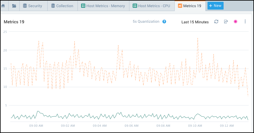
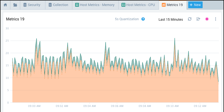
The screenshots below shows a line chart and an area chart for the same query, with default settings for chart styles and options.
Default line chart
Default area chart
Set chart-level options
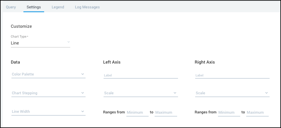
On the Settings tab for a metric query you can set the chart type, and configure a number of options that affect the chart as a whole, like the colors used, the width of lines, and for chart axes, the label, scale, and value ranges that are displayed.
To view the Settings tab:
Run a metric query.
Select the Settings tab.
Set chart type
Run a metric query, and click the Settings tab.
To change the chart type, click the down arrow next to Chart Type, and select the desired chart type.
Set color palette for a chart
Run a metric query, and click the Settings tab.
To change the color palette, click the down arrow and select a palette.
You can also specify color settings for your visualization at the query and time series level. Settings at the query level overwrite settings at the chart level, and settings at the time series level overwrite settings at the query and chart levels.
Set chart stepping for a line chart
The chart stepping option applies to line charts only.
A step chart is a line chart that does not use the shortest distance to connect two data points. Instead, it uses vertical and horizontal lines to connect the data points in a series forming a step-like progression. The vertical parts of a step chart denote changes in the data and their magnitude.
To set up chart stepping, click the down arrow next to Chart Stepping and select one of the following:
- Left. The vertical step for a plotted value will appear at the start of the time bucket.
- Center. The vertical step for a plotted value will appear in the middle of the time bucket.
- Right. The vertical step for a plotted value will appear at the end of the time bucket.
Set chart stacking for an area chart
The chart stacking option applies to area charts only.
A stacked area chart presents multiple data series showing part-to-whole relationships or for cumulative series of values.
Open the Settings tab for your chart.
Click the down arrow next to Chart Stacking, and select one of the following:
- Stacked. If your query returns multiple time series, they are presented in stacked form, each point starting from the point left by the previous data series. A stacked chart represents the total of all the data plotted.
- Percent. With this visualization, the y axis scale is always 100%. Each area of color represents one part of the whole. The parts are stacked up vertically. The height of each colored stack represents the percentage proportion of that category at a given point in time.
Set line width for a chart
By default, lines on a line chart are 1px wide. To change the line widths:
Open the Settings tab for your chart.
Click the down arrow and select one of the following:
- 2px
- 3px
Set up axis settings for a chart
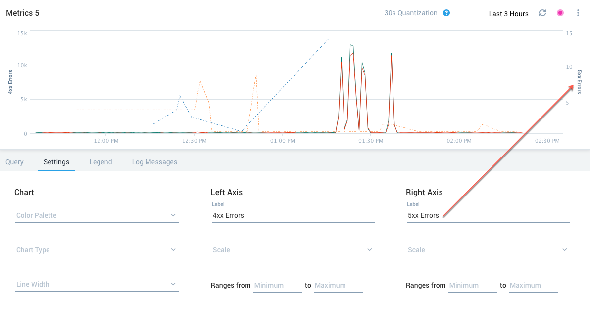
You can assign a label to appear next to the left side Y axis, add a right side Y axis if desired, and set the scale type and value range for both axis.
- Open the Settings tab for the chart.
- Label. Enter the text to appear next to the axis. The name you give to the left (primary) axis is displayed in the chart area as soon as you enter a value. The right axis is shown only if you associate it with a query.
- Scale. By default, the scale is linear. Click the down arrow to select "Logarithmic".
- Ranges from. By default, Sumo determines what range of values to present based on query results. If you want, you can set Minimum and Maximum values, so that Sumo will only present results within that range.
Set query-level options
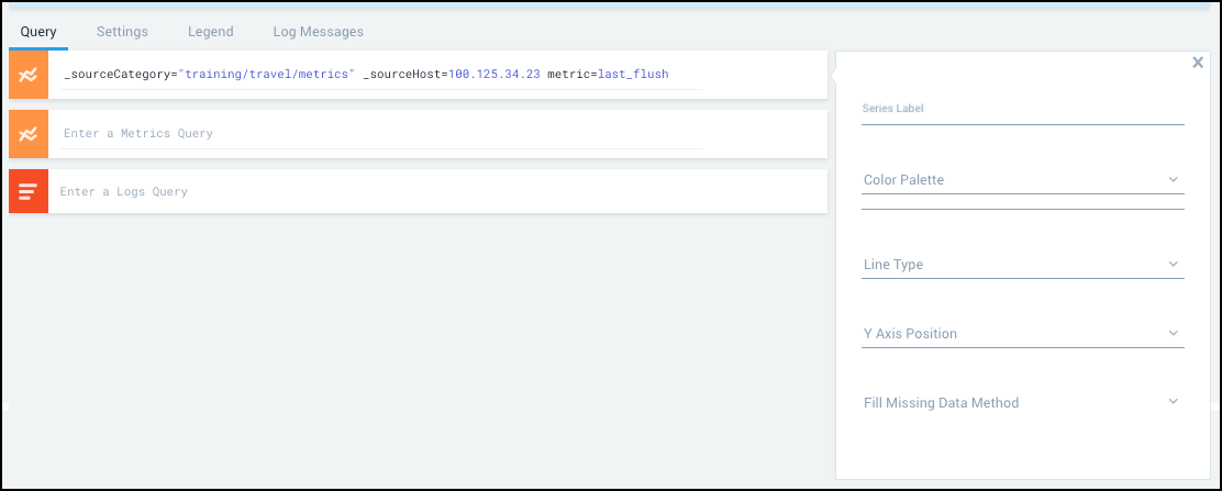
Add custom labels to time series
The default label for each metrics time series is a comma-separated list of the dimensions included in the query. The resulting labels can be lengthy and inconvenient to scan.
To shorten the labels and make them more meaningful in your metrics visualizations and dashboards, you can apply a naming convention for time series labels on a per-query basis. The labels can include text and also parameters that are enclosed in double curly braces.
Example
Consider the metrics visualization shown in the following figure. It includes two queries.
The first query displays the average of user CPU activity over a set of source hosts.
metric=CPU_User _sourceHost=*cq*split* | avg
The second query averages the same information per source host.
metric=CPU_User _sourceHost=*cq*split* | avg by _sourceHost
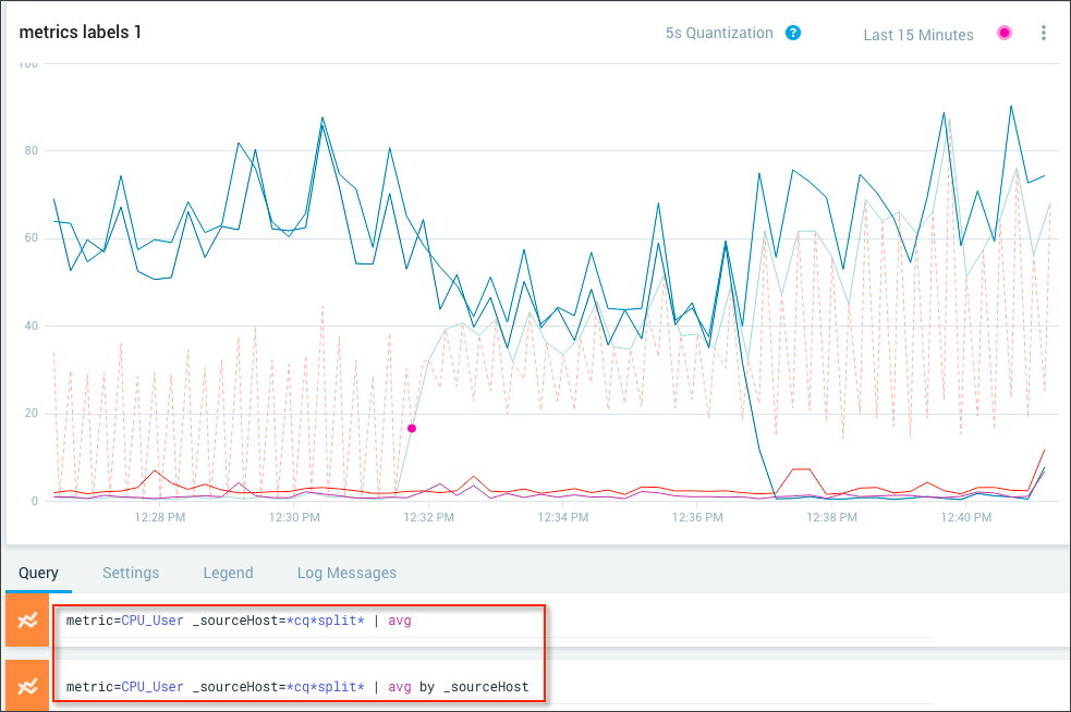
The default labels for the query as shown in the hover details provide useful information, but might not be informative enough for what you want to highlight.
For example, suppose you want to emphasize that the first query is a baseline against which you’re comparing behavior for individual source hosts. You can re-label the queries accordingly.
Click the gear icon to the right of each query and add the label in the Series Label field. You can include text and variables enclosed in double curly brackets. Press Return to implement the change.
For this example, we’ll apply the labels shown in the figures.
The first query label indicates the baseline.

The second query label is a variable for the source host (with the variable name enclosed in double curly brackets).

The hover details now show the assigned labels. For the baseline query, only the Baseline text is displayed.
For the query by source host, only the source host is displayed.
The assigned label must be unique for each time series for your visualization to display. If you create a custom label and more than one time series has the same label, an error message is displayed, and the custom label isn’t applied.

You can work around this issue by making your custom label more specific so that each time series becomes unique. For example, in the query above, you can add source host to help make your time series more unique.
To see what custom labels have been defined, open the Legend tab. If there custom labels they appear in the Label column.

Set color palette for a query
On the Query tab, click the gear icon to the right of a query. Click the Color Palette down arrow. Select a color palette from the options displayed. The color palette is changed immediately in the chart.
Set line type for a query
Open the Query tab and click the gear icon on the right of a query. An area opens for you to select a line type (dotted, dashed, solid, and so on).
Associate query with Y axis
To associate a query with a Y axis, open the Query tab and click the Gear icon to the right of a query. An area opens for you to select a line type and axis position.
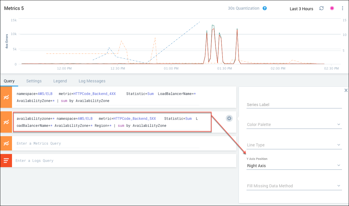
Select Right Axis or Left Axis. If the axis label is not already shown on the chart, it is displayed as soon as you make your selection.
Any queries that are not associated with the right axis are automatically associated with the left axis.
Decide how to handle missing data
The Fill Missing Data Method option allows you to specify how to handle gaps in your time series data.
By default, Sumo interpolates the missing data; however in some cases, another solution may be preferable.
To set the fill missing method, open the Query tab and click the gear icon to the right of a query. Click Fill Missing Data Method and select one of these options:
- Interpolation. This is the default option, in which successive values are connected by a line.
- Empty. With this option, a gap in the time series data is represented by an actual gap in the visualization. For example, if your visualization includes an interval during which your systems were down for planned maintenance, you might want your visualization to make it clear that there was no data to report during that interval.
- Fixed. This option assigns a particular value in the interval with missing data. For example, if you are counting the number of logins, a gap in the data might mean that no logins occurred during that time. You can select Fixed and assign 0 as the value to indicate that no login activity occurred.
- Last. This option is appropriate if your data involves infrequent observations and you want to retain the value of an observation until the next observation is recorded. For example, if you are collecting temperature data from a sensor as part of an Internet of things (IOT) application, you might want your visualization to continue to report the last temperature measurement until a new measurement comes in.
Set time series-level options
Set color for a time series
You can specify the color palette for your visualization at the time series, query, and chart level. Settings at the query level overwrite settings at the chart level, and settings at the time series level overwrite settings at the query and chart levels.
Open the Legend tab and click the gear icon to the left of a time series. Select a palette from the Color Palette menu. To specify a hex value, scroll down and click Custom Color, and enter a value (example: #29A1E6).
Name your visualization
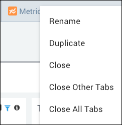
To assign a name to a visualization, hover over the tab, click the dotted icon, and select Rename. Enter a new name and click Rename.
