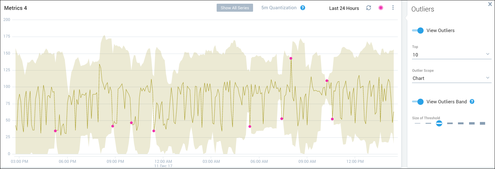
Metrics Outliers
note
This topic has information about Sumo Logic's Classic metrics UI. For information about the Metric Explorer UI, which replaces the Classic metrics UI, see Metrics Explorer.
The metrics outlier feature allows you to identify metrics data points that are outside the range of expected values. You can use outliers to pinpoint unusual behavior in your metrics visualizations and track the behavior over time. Flexible controls are available for you to decide how unexpected a value must be to be labeled an outlier and the number and type of outliers to display.
What is an outlier?
For each data point, Sumo Logic computes an expected value based on the most recent values leading up to that data point. The threshold for a data point is one or more standard deviations around the expected value. If a data point is outside the threshold, it is considered to be an outlier.
note
The algorithm used to calculate metrics outliers is similar to the algorithm for the logs query outlier operator.
Working with outliers
To display the outliers controls, create a visualization on the Metrics page, and then click the pink Outlier icon.
Click View Outliers to enable or disable outliers. If you create a new visualization, the outliers functionality is enabled by default. If you’re working with an existing visualization, you’ll need to enable outliers.
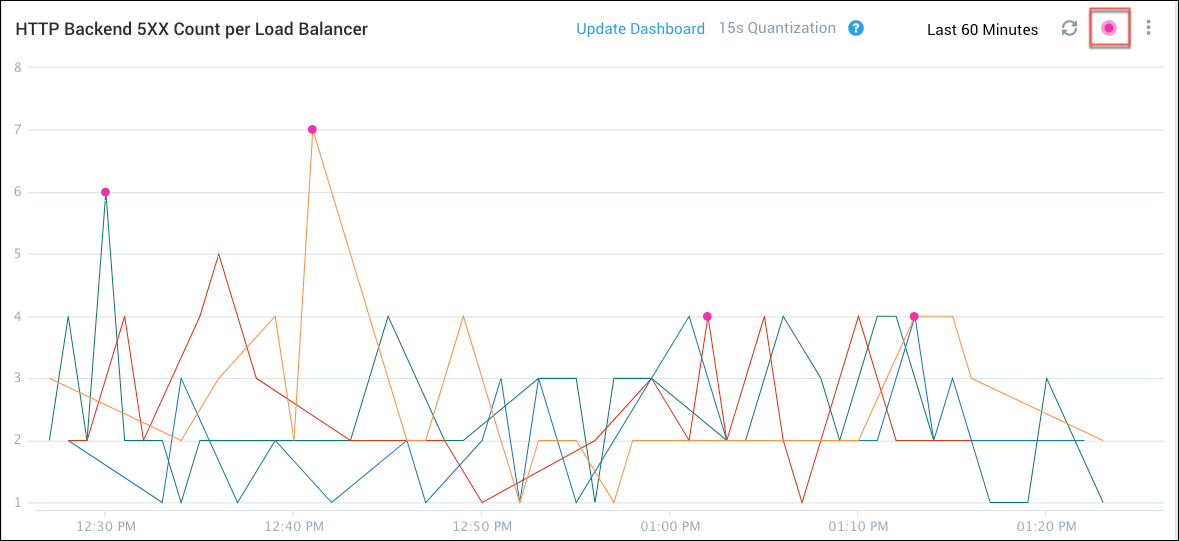
The Outliers panel appears.
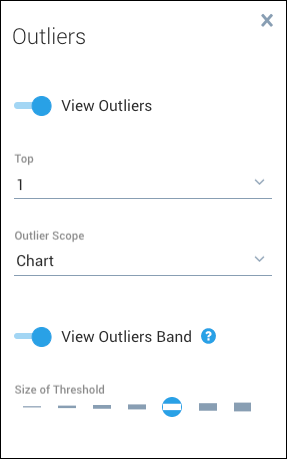
Select from the following user controls. The visualization updates automatically in response to the changes that you make.
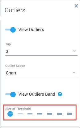
- Top. Specify how many of the top outliers to display (1, 10, or 15). The top outliers are the ones with the highest number of standard deviations from the expected value.
- Outlier Scope. The scope determines how the data is grouped when deciding what qualifies as top outliers.
- Chart. All outliers in the entire chart are considered together when calculating and displaying top outliers.
- Query. For each query, a separate set of outliers is calculated and displayed.
- Series. For each time series, a separate set of outliers is calculated and displayed.
- View Outliers Band. Shows the range of data points for a chart that are within the currently outlier threshold.
- Size of Threshold. Specify from 1 to 7 standard deviations.
The following examples show how the user controls affect what outliers are displayed.
Example: Threshold
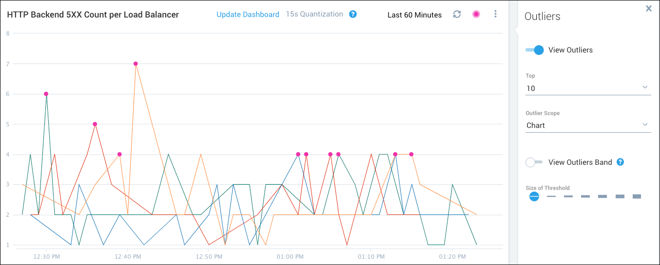
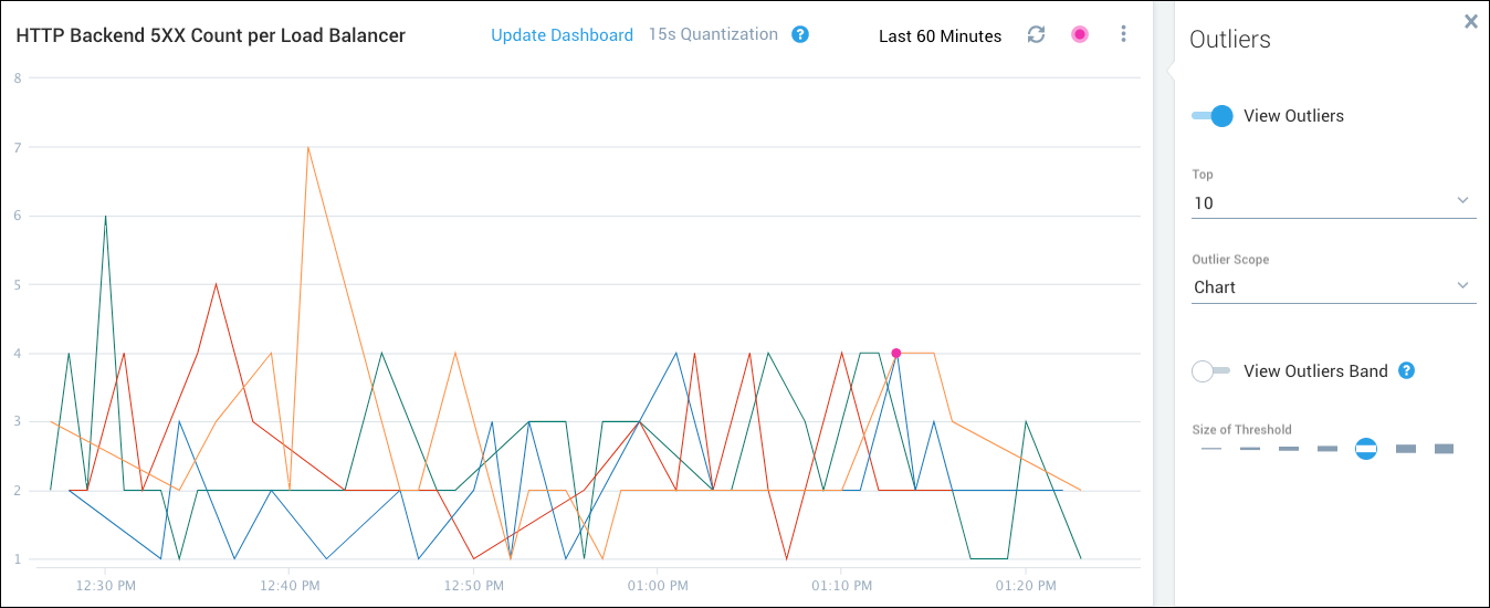
The following figure shows the top 10 outliers for a query when the threshold is set to 1. The top 10 data points that are more than 1 standard deviation from the expected value are marked.
The following figure shows the same data when the threshold is set to 5. Only 1 data point is more than 5 standard deviations from the expected value.
Example: 1 top outlier per series, query, and chart
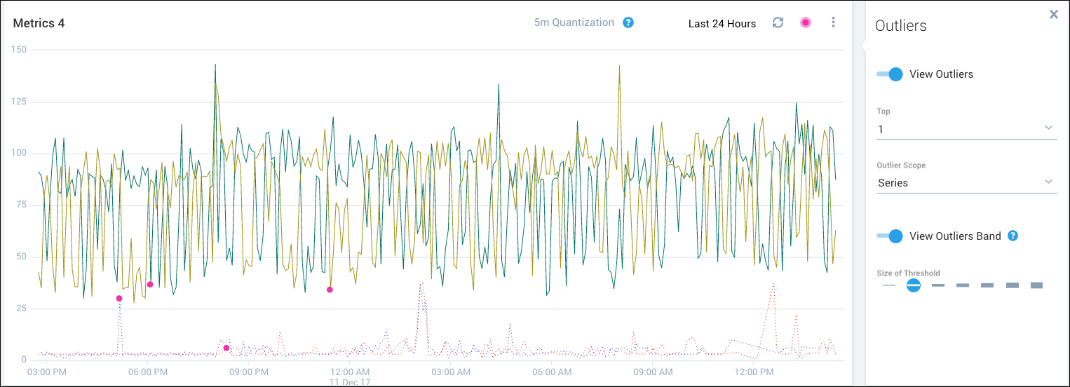
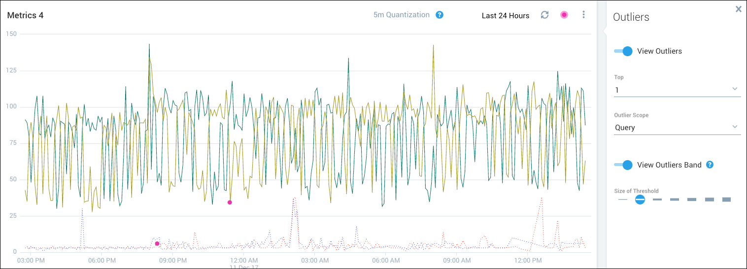
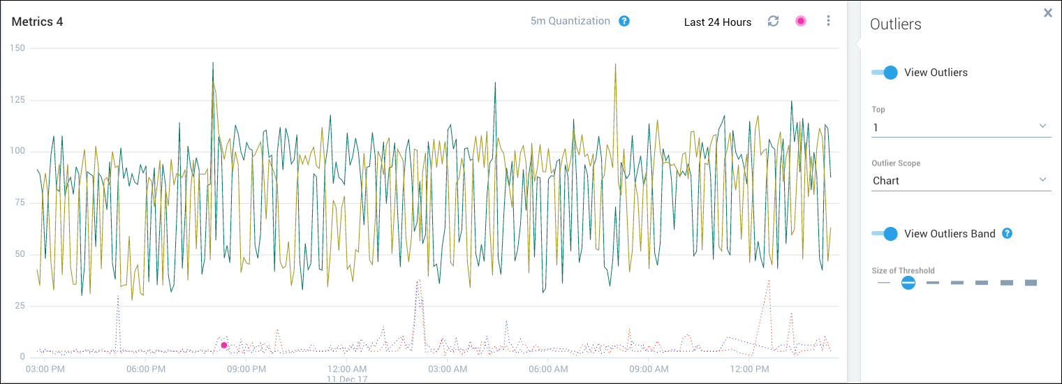
This example shows how the calculation of the top outlier varies according to scope (series, query, or chart). The visualization is based on these queries:
- Query A has two time series and is shown with solid lines.
- Query B has two time series and is shown with dotted lines.
The following figure shows the top outlier per series. Four outliers are marked, one for each time series (two for query A and two for query B).
The following figure shows the top outlier per query. The visualization was generated from two queries, so two outliers are marked.
The following figure shows the top outlier per chart. The only outlier that is marked is the top one for the entire chart.
Example: Multiple top outliers
The following figure shows the visualization with 10 outliers per series selected. Each time series has multiple outliers identified (up to 10 for each series).
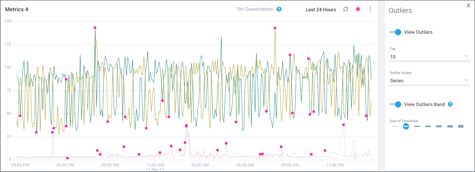
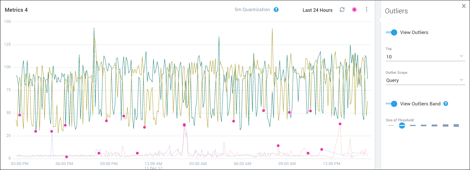
The following figure shows the visualization with 10 outliers per query selected. Each query has multiple outliers identified (up to 10 for each query).
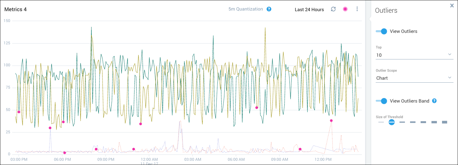
This figure shows the top 10 outliers per chart.
Outlier details
Hover over an outlier data point to view the following details:
- Value of the data point.
- Ranking of the data point among the top reported outliers. In the following figure, rank 3 of 4 means that this data point has the third highest standard deviation among the four reported outliers.
- Range of expected values based on the computed threshold.
- Standard deviation as calculated from the most recent values leading up to the data point.
- Date and time of the data point.
- The metadata that identify the time series with the outlier
Outlier bands
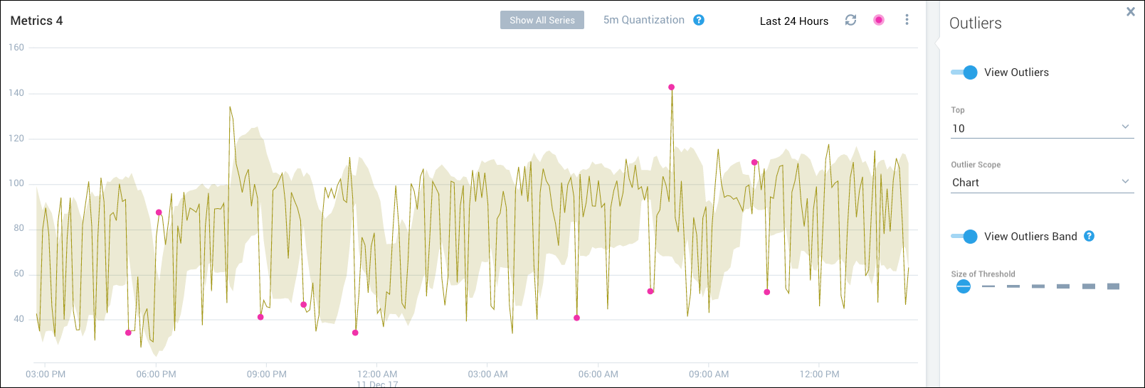
You can enhance your outlier visualization by identifying the range of data points for a chart that are within the outlier threshold.
To view the outlier band for a chart:
Select the Line chart type for your visualization.
Enable View Outliers and View Outliers Band in the Outliers panel.
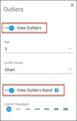
Select a threshold to determine the sensitivity of the outlier band. The higher the threshold, the wider the range of values within the threshold.
Click a time series chart to select it and display the outlier band. This action changes the focus to the selected time series, hides the other time series in the visualization, and displays the outlier band.
Click away from the line anywhere in the chart to hide the band and redisplay all of the charts in the visualization.
If you change the threshold, the band adjusts accordingly. For example, the previous figure is based on a threshold of 1 (standard deviation). The following figure shows the same data with a threshold of 3 (standard deviations).
