Create and Tailor Single Value Metric Charts
note
This topic has information about Sumo Logic's Classic metrics UI. For information about the Metric Explorer UI, which replaces the Classic metrics UI, see Metrics Explorer.
A single value metric chart is useful for summarizing a time series in a single value, and making that value stand out at a glance. For example, you might want to a dashboard panel that displays the current CPU utilization in a cluster, the maximum network latency, or the average error count over the last 15 minutes. Here’s an example of a single value chart:
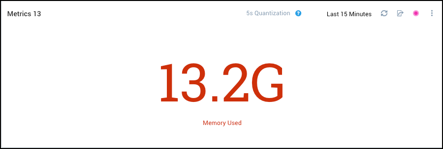
Create a single value metric chart
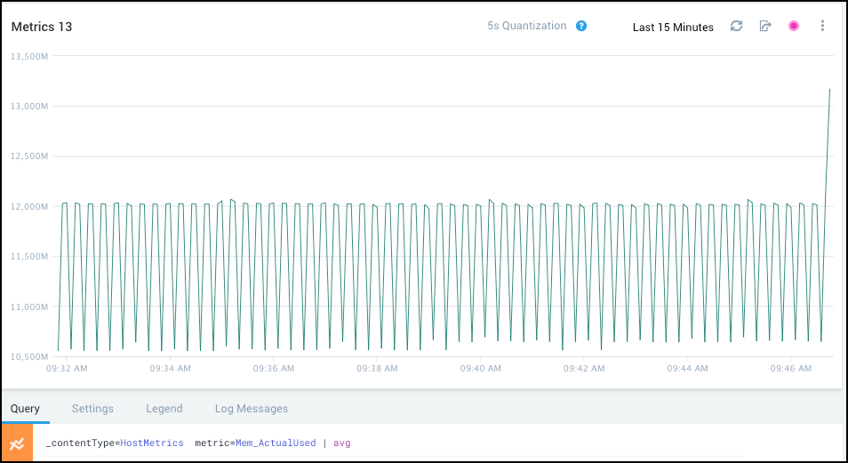
Run a metric query that returns a single time series. For example:
Click the Settings tab.
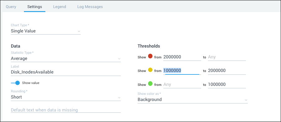
Chart Type. Select Single Value.
Available data. You can select the data upon which the chart will be based:
Stat type
- Latest. The most recent value.
- Average. The average value across the time range.
- Count. The number of values across the time range.
- Minimum. The minimum value in the time range.
- Maximum.The maximum value in the time range.
- Sum. The sum of values in the time range.
Label (Optional). The text you supply will appear below the value on the chart.
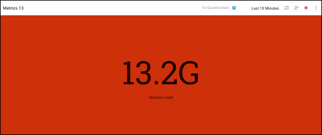
Show value. Toggle to hide the value and the label on the chart. If you map value ranges to green, yellow, and red, hide the value and label, and set Show color as to "Background", the chart will display a a plain colored panel like this:

Rounding. By default, Sumo presents a value rounded by thousands. For example.
1,234 is presented as 1.23k
1,234,567 is presented as 1.23M
1,234,567,890 is presented as 1.23GTo turn off rounding, set Rounding to None.
Threshold (Optional). Use these setting to map value ranges to red, yellow, and green. If you do, the appropriate color will be used in the chart, based on the chart value. For more information, see Specifying value ranges below.
(red) Ranges from. Enter the minimum and maximum values that define the range of values that you want to appear in red.
(orange) Ranges from. Enter the minimum and maximum values that define the range of values that you want to appear in yellow.
(green) Ranges from. Enter the minimum and maximum values that define the range of values that you want to appear in green.
Show color as. Changes how threshold color are presented. With the default setting, "Text", the value is presented in colored font on a white background. When you toggle Show color as the value is presented in black font with a colored background.
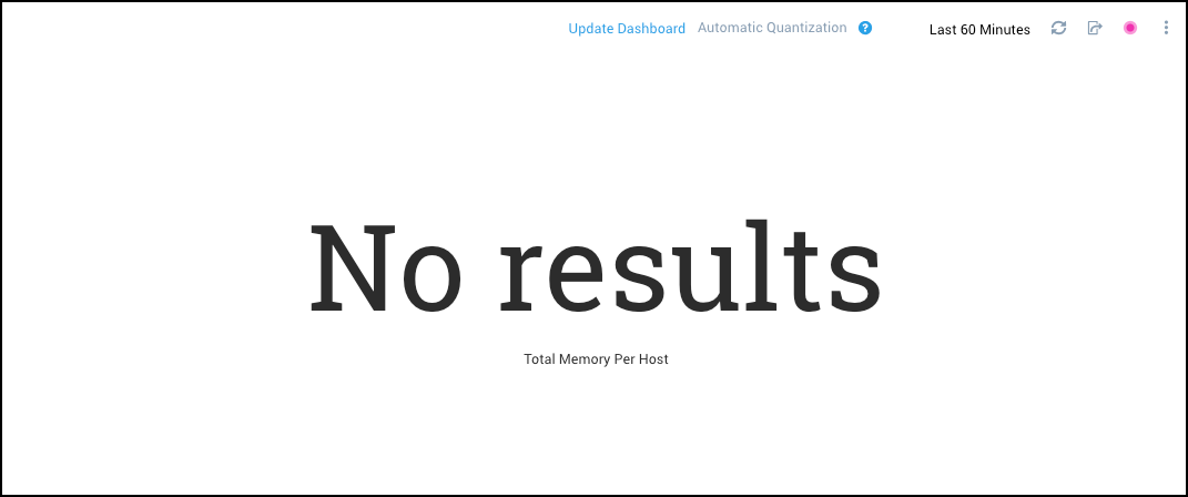
Default text when data is missing (Optional). Enter the text or value you would like to appear in the chart if the query does not return any results. The text you enter will be displayed when the metric query returns no results. For example:
note
If you specify a numeric value, it will trigger any color thresholds you define.
Specifying value ranges
You can specify three value ranges, one for red, yellow, or green. You don’t have to specify all three. For example, you can set value ranges for red and green only, if desired.
You can leave the upper or lower bound for a value range blank to include all values greater than or less than a threshold in the range.
Sumo evaluates the value ranges in red-yellow-green order. If your ranges overlap, the threshold setting for the red range take precedence over the yellow range settings, and the settings for the yellow range take precedence over the green range settings.
Here’s an example of how Sumo evaluates the threshold values you set. Given these settings:
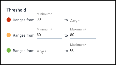
Sumo color-codes query results like this:
- A value of 80 or greater is red.
- A value that is 60 or greater, and less than or equal to 80, is yellow.
- A value that less than 60 or less is green.